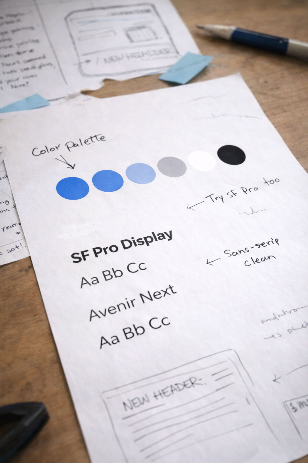
Color and typography services for visual brand systems, type direction, and brand consistency

A More Cohesive Visual System

Color and type that make your brand feel intentional.

We define the color palette and type system that give your brand a clearer tone, stronger readability, and more consistency across future design work.

Overview

Your color and type are doing more work than you realize.

Color and typography are two of the most constant things in your brand. They show up on your website, your print pieces, your ads, your signage, your packaging, and every piece your team produces. When they are chosen well and defined clearly, your brand looks more intentional, reads more cleanly, and stays more consistent no matter who is making the next thing. We develop the palette and type system your business can use with confidence, documented so the work holds up over time.

Ready to get started?

The Choices

We build a palette and type system that belong to your brand.

Color and typography should feel like they were made for your business specifically. We develop the palette and type direction together so the choices reflect your brand personality, reinforce the right tone, and give every piece of content a stronger and more recognizable visual foundation to work from.

The Applications

We make sure the system holds up everywhere it has to work.

A palette can look different on screen than it does in print. A typeface can be perfect in a headline and still need a better partner for body copy. We think through your real-world applications, digital, print, signage, packaging, and everyday brand use, so your colors and typography keep their character across every format they need to carry.

The Handoff

Organized, spec'd, and ready for your whole team to use.

We organize the specs, font files, usage examples, and documentation so your designers, vendors, and team members have something practical to work from every time a new piece needs to get made. Everyone works from the same reference. The standard holds.

Ready to get started?

Ready to get started?

People feel your colors and type before they read a single word.

Before someone absorbs your headline or your offer, they have already formed an impression from your palette and your type. Polished or cheap. Warm or cold. Premium or forgettable. Those signals fire fast and silently, and they shape everything that follows. We choose the elements with intention so the tone you want to project is the tone people actually feel.

  • Visual tone that reinforces your brand positioning
  • A palette that works across light and dark applications
  • Typography that is readable, distinctive, and on-brand

Strong color and type choices carry your brand across every format.

A palette can look one way on screen and another in print. A typeface can shine in a headline and still need a better partner for longer copy. Your color and type need to hold up across digital, print, signage, packaging, and everyday brand use without losing their character. We think through every application so the system stays sharp across every format it has to work in.

  • Color and type that adapt to format demands
  • More alignment across print and digital applications
  • A system your whole team can apply correctly

Ready to get started?

FAQ

Common questions

Clear, practical answers to help you decide scope, timing, and the right next step.

Why do color and typography choices carry so much weight?

Because people feel them before they think about them. They shape tone, recognition, readability, and the overall level of polish your brand gives off in a split second.

How do you decide what palette and type system fit a business?

We look at how your business should feel, how it needs to perform across formats, and what kind of impression you want people to walk away with. Then we choose a system that can keep up with real use.

Can this work happen on its own or only inside a full branding project?

It can absolutely stand on its own when the biggest opportunity is sharpening the palette, the typography, and the visual tone your brand is already carrying.

Need a hand? We’re ready when you are.

A little direction is enough to get started. We’ll help sort out the details from there.