Our Work

Throughike

Throughike was building a brand around modular backpacking gear and a rugged outdoor point of view rooted in the Shawnee National Forest, but it needed a sharper identity before the company could show up with the kind of confidence the category demands. The goal was to create something that still felt connected to Southern Illinois and the Shawnee, while also feeling broad enough to belong in the wider outdoor category. The work focused on building the logo mark, identity direction, and brand voice that could make the company feel more established across launch materials, packaging, and product-facing promotion.

Throughike logo advertisement design

Project Snapshot

What this project included

  • A logo mark and variations built to feel distinct in a crowded outdoor gear category.
  • A stronger brand identity that could carry across tags, packaging, ads, and launch materials.
  • Brand voice work that helped the company sound more established and more intentional.
  • A cleaner launch foundation built around identity, messaging, and recognizable brand presence.
ClientThroughike
IndustryOutdoor Gear & Sporting Goods
CategoriesBranding · Identity · Copywriting

Case Study

How the work came together

Logo mark development, brand identity, voice direction, and launch-ready brand assets for an outdoor gear company that needed to look established before it had years of market history behind it.

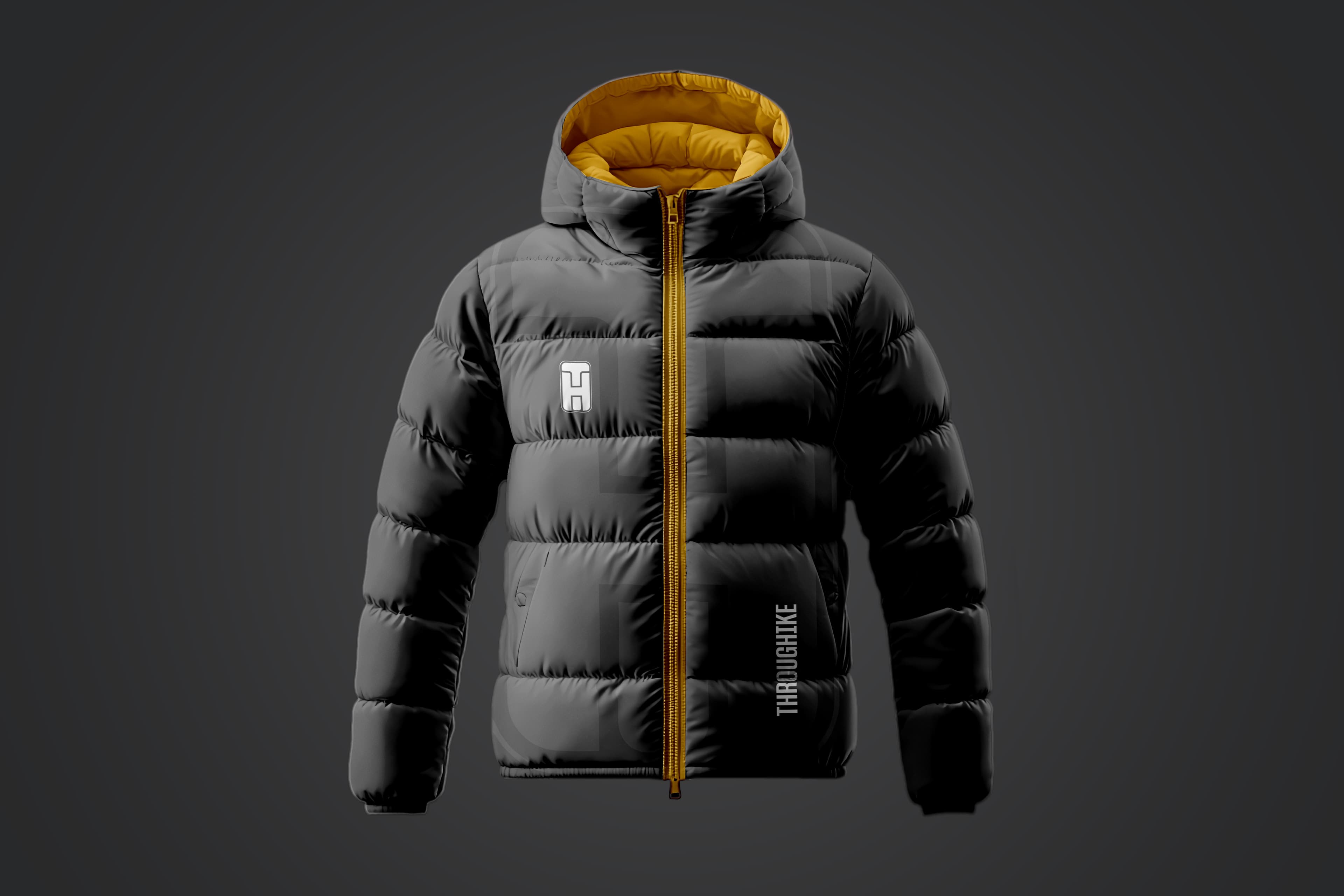
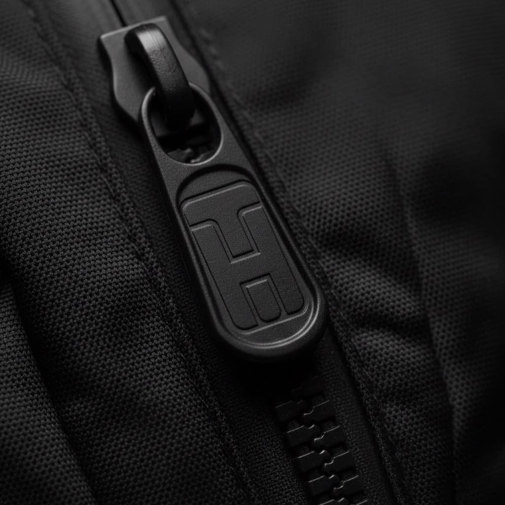
What the brand needed to establish

Outdoor gear lives in a category full of familiar badges, rugged type, and interchangeable branding. Throughike needed something more distinct than another generic outdoors look. The goal was to make the brand feel serious, memorable, and built for people who actually spend time on trails. It also needed to carry some roots in the Shawnee National Forest while still feeling relevant to outdoor culture more broadly, and support a product story built around modular, lightweight packs without feeling overdesigned or gimmicky.

Why the voice mattered too

A stronger mark helps people recognize a brand, but the language is what makes it feel believable. Throughike needed words that matched the visual direction and made the company sound like it already belonged in the category. That combination made the launch materials feel more complete and gave the brand a better shot at feeling established from day one.

What we built around the identity

This project was centered on the identity itself. We did not build the website. The work focused on the mark, the visual system around it, the brand voice, and the launch-ready pieces that would make the brand feel cohesive anywhere it showed up, from product tags to ads to branded merchandise. The logo mark was designed with a subtle, almost subliminal face inspired by Easter Island head statues, which gave it a more recognizable character without making the concept feel obvious or forced.

  • Logo mark development with supporting variations
  • Brand identity direction for launch materials and product-facing assets
  • Brand voice and messaging support
  • Creative built for tags, posters, product details, and branded applications

Need work like this for your business?

If you need a similar mix of creative, strategy, or execution, tell us what needs to improve and where things stand. We can help shape the right next move from there.

Related Projects

More work in this lane

Jackson County Historical Society

Exploratory branding concepts for a community organization that wanted to look more established, usable, and recognizable in public-facing applications.

Liberty Home Services

Patriotic logo design, website design and development, and supporting brand applications for a local handyman and home repair company that needed a stronger identity and a more credible online presence.

Saucy Mama

Weekly email marketing, copywriting, and ongoing campaign support for a pregnancy-focused skincare brand built around a highly specific audience and product story.