Why brands look inconsistent even when the logo is correct
Most consistency problems are not logo problems. They are system problems. A business may have a solid logo and still look disjointed because every new asset is designed from scratch by a different person, for a different channel, under different time pressure.
That inconsistency shows up in typography, spacing, image style, messaging tone, and layout decisions. It makes the business look less established, and it can reduce trust even when the underlying service is excellent.
The fix is not rigidly forcing every asset to look identical. The fix is creating a brand system that preserves recognition while allowing flexibility for different channels and campaign goals.
What a practical brand system needs
A useful brand system should help a team make faster decisions, not create a giant PDF nobody uses. The best systems identify the decisions that drive recognition and quality, then make those decisions easy to repeat.
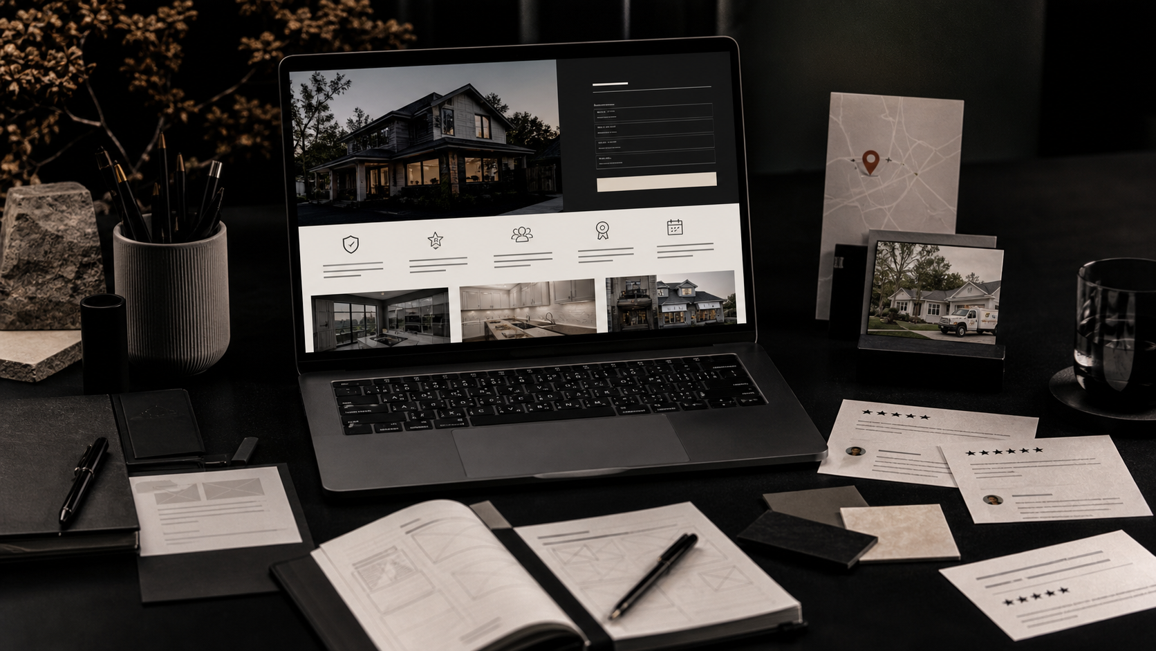
For most growing businesses, a lightweight but well-defined system is more effective than a massive style guide. Focus on the elements that appear across the website, social content, ads, sales collateral, signage, packaging, and internal templates.
- Primary and secondary logo usage rules
- Typography system (headlines, body copy, captions, UI text)
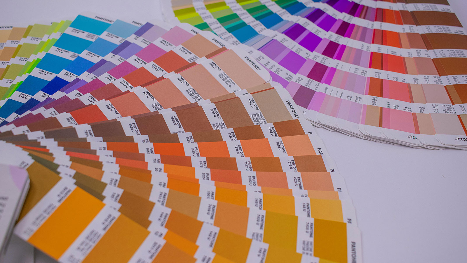
- Color system with usage hierarchy and application guidance
- Image direction and art style guidance
- Layout patterns for common asset types
- Voice and messaging rules for headlines and CTA language
- Template files for recurring marketing formats
How to stay consistent across different channels without forcing sameness
Your homepage, a postcard, a display ad, and an Instagram reel cover frame should not look identical. They should feel related. Consistency is about recognizable decisions, not repeated templates in every medium.
That means defining which elements stay fixed and which can flex. For example, your type hierarchy, color priorities, and tone of voice may stay stable while composition, crop style, and pacing change based on channel requirements.
This is where creative direction adds value. The system should guide fast execution, but it also needs enough range to support campaigns, seasonal promotions, and niche audiences.

A workflow that keeps teams, freelancers, and vendors aligned
Brand inconsistency often happens at handoff points. A business owner briefs a vendor verbally, another vendor uses an old logo file, and someone else writes copy with a different tone. Even strong individual work can feel disconnected when the system is missing.
A better workflow starts with shared source files, approved templates, and clear creative direction notes attached to each campaign. When working with multiple partners, one person or team should own final creative alignment before assets are published or printed.
- Maintain one current asset library (logos, fonts, color values, templates).
- Use campaign briefs that define goal, audience, offer, and CTA.
- Provide channel-specific specs and format requirements up front.
- Review work for brand alignment before production or publishing.
- Archive approved assets so future work starts from the right version.
What to fix first if your brand already feels inconsistent
Do not try to redesign everything at once. Start where inconsistency creates the most visible trust friction: website core pages, top-performing ad creatives, sales collateral, and any customer-facing print pieces used regularly.
Once those are aligned, create templates and guidelines around the patterns that worked. This gives you a system based on active usage instead of a hypothetical style guide.
- Homepage and primary service pages
- Core ad templates and campaign graphics
- Sales deck, proposal, or estimate presentation assets
- Frequently used print collateral (cards, flyers, signage, handouts)
- Social templates for recurring post formats
Why consistency improves performance and aesthetics
Brand consistency improves trust, but it also improves production speed and campaign performance. When a team does not reinvent every asset, approvals move faster and testing becomes more meaningful because the variables are clearer.
Consistent creative systems also make websites and campaigns easier to scale. New offers, pages, and content pieces can be launched faster while still feeling on-brand, which is one of the biggest advantages a growing business can create.
Frequently Asked Questions
Do small businesses need a full brand book?
Not always. Many businesses benefit more from a practical working brand system and templates than a giant brand book that never gets opened again. The key is usability and day-to-day consistency.
Can we improve consistency without a full rebrand?
Yes. Many brands can improve dramatically by tightening typography, color use, templates, and messaging rules while keeping core identity elements.
Who should own brand consistency internally?
Ideally one decision-maker or small team should own final alignment, even if multiple people create assets. Shared ownership without final review usually creates drift.
Related Services & Reading
Need help applying this?
Need a brand system that works everywhere your brand shows up?
We help businesses create practical brand systems and creative direction workflows for websites, ads, print, and ongoing marketing assets.