


Website Design & Development

Website Design & Development: Responsive Web Design

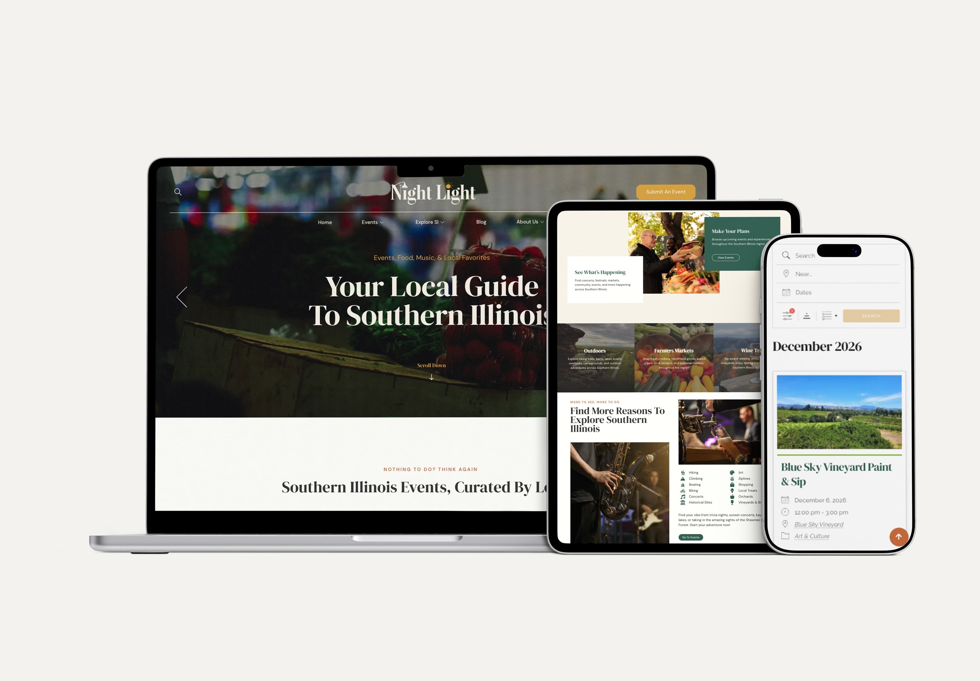
A site designed for a desktop screen and merely squeezed onto a phone frustrates the majority of visitors who show up on mobile, and frustration on a first visit rarely gets a second chance.

Challenges

Website Design & Development: Responsive Web Design

01

What you are commissioning

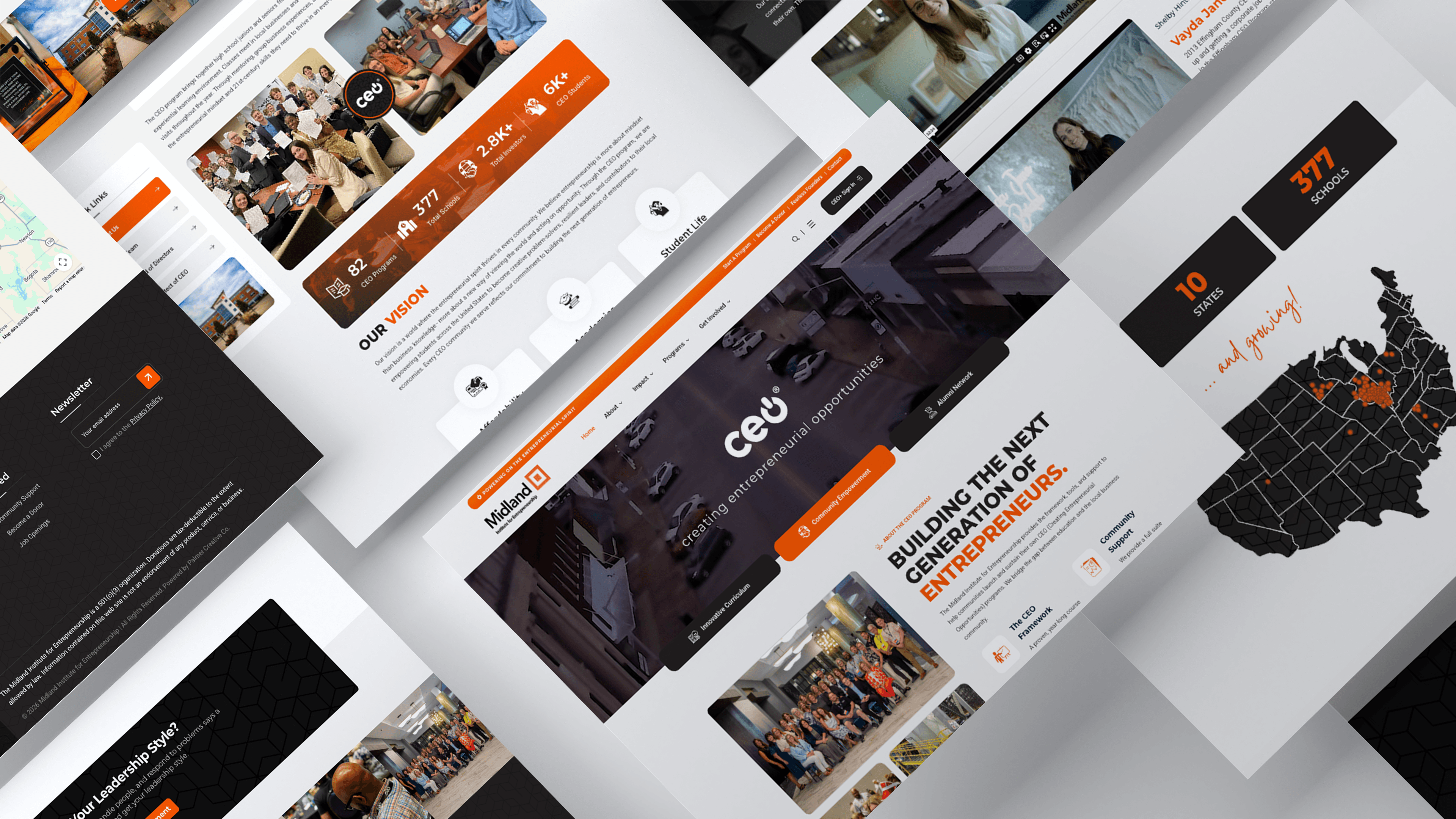
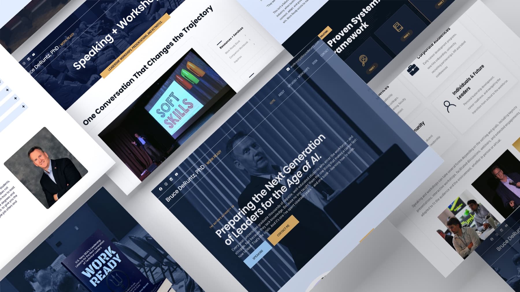
Responsive design means rethinking navigation, touch targets, image loading, and content priority for how each device gets used, and we test across real devices throughout the build, so the mobile experience gets designed deliberately, not as an afterthought.


Companies we’ve worked with

A few familiar faces

Our process

From the first conversation to delivery.

01

Understand

We design layouts and navigation with mobile-first priorities, so the majority of visitors get the best experience, with the strongest experience on the device they use most.

02

Create

We create responsive breakpoints tested across real device sizes, so nothing breaks between a phone and a widescreen monitor.

03

Deliver

We test performance and usability on actual phones and tablets before launch, so problems get caught before visitors find them.

FAQ

Before we get started.

Is responsive design included in every website project?

Yes, every site we build is responsive by default.

Can you fix responsive issues on our existing site?

Yes, we can audit and repair responsive problems on an existing site when the underlying structure allows it.